Navigating your website should be simple and intuitive. That’s what your visitors expect and what they deserve. Wondering about how to make your website more navigable for users? Follow the tips below!
1. Start with a Plan
Start at the beginning. Every great project starts with proper planning, so decide from the onset what features and services the website will offer and how those will be displayed from the main menu onwards.
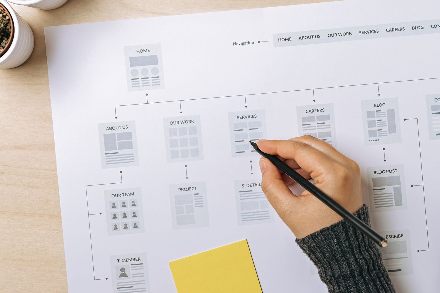
A website menu at this preliminary stage is usually referred to as a sitemap and is usually displayed on a spreadsheet featuring all the information and various levels. There is really no good or bad way to go about presenting this sitemap--just present it in a manner that is easy to understand so your developer has a clear idea of what’s in your mind.
2. User-Friendly Language Is Key
Deep down you probably want to create website copy that is clever, compelling, and makes your brand stand out. However, that should never come at the expense of user experience and clarity. Any wording or language that takes more than a split second to understand or which forces the reader to click in order for them to understand is taking away from the overall user experience. It might be a good idea to use A/B testing to see what works best, but here is a reliable rule of thumb: keep primary navigation simple, reserve clever words and personality for popups and notifications.
3. Stick to Conventions
No need to reinvent the wheel; stick with conventions for greater efficiency. The reason why conventional standards get to be so widely accepted is because they work well. Unless you can come up with something even more intuitive than what already exists in the web design space it would be best to stick with what works. Current web design conventions enable you to still be able to find your way around a website even if the copy is in a language you don’t understand.
4. Primary Navigation Should Stand Out
Primary navigation should stand out and remain consistent throughout the website. For example, the main menu should stay in the same place no matter what page the user is on. It should also should be made of a contrasting color so that it stands out and attracts the attention of visitors.
5. The Logo Should Link Back to the Homepage
You can be sure your visitors will be looking out for this. For a convention that is so widely accepted, you would be surprised at the number of websites that choose to ignore it. Let your logo lead back to the homepage when clicked. Also, the conventional position for a logo is at the top left or, in some cases, centred along the top.
6. Responsive Navigation
In a mobile first world, the importance of responsive design cannot be overstated. You need to make sure your website looks good on any screen, and a key part of that entails making your website easily navigable on all screens. Most often this will mean using a hamburger icon for the menu. The hamburger icon is popular enough to effectively tuck your menu away without confusing your audience.
Final Thoughts
A website is a worthy investment for any project you have in mind. It would be a shame if you failed to get the desired return from your investment because of something as simple and avoidable as navigation issues. Are you in doubt about how navigable your website is? Reach out to us at Eternity today. We would love to help.


