There are many reasons why visitors may be giving your website the hand. Here are a few which you can investigate right now:
1. Outdated Website Design
As much as we hate to admit it, we all judge books by their covers; and this is even more true in the case of websites. Web design matters. In a study carried out by the psychologist and researcher, Dr. Elizabeth Sillence, where participants were asked to review websites related to the subject of hypertension, 94% of respondents attributed their uneasiness to the website design. If it is been more than a few years since you redesigned your website, now would be the time to start seriously thinking about investing in it.
2. Poor Content Legibility
The choice of font and other matters like background colors fall under design, but they merit special mention here because of how important they are. Simply put, the harder it is to read your content, the harder it will be for your content to convert. There are very few hard and fast rules when it comes to content, but generally high-contrast color combinations and ornamentation-free serif and sans serif work well.
3. Too Many Ads
We get it, you decided to monetize your site by placing some ads. Great idea. Just don’t overdo it. Don’t let ads be the first thing they see; don’t let them be them obstruct or interfere with the reading experience; don’t let them take more space than the content that attracted the visitor in the first place. If you find you are unable to completely do away with ads, you can place them in sensible positions that do not take away from the user experience on the site.
4. Your Website Uses Outdated Plugins
Your visitors don’t have the time or desire to download updated versions of forgotten software just to read content on your website which they can read somewhere else. The fewer issues like these, the better for your website.
5. Poor Navigation
Poor navigation is such a strong cause of poor user experience that even search engines like Google, deduct SEO points for it. You want to make it as easy as possible for your visitors to find the information they need. Look at your website through the eyes of your ideal customer to find out the best way your website can be rearranged to make information easily available.
6. Obtrusive Registration Requirements
Yeah, you need gated content to create leads and make sales. But putting a barrier on everything on your website will take away from the user experience and drive people away from your site. Along the same vein, you want to make your registration requirements as streamlined as possible, sometimes taking out one unnecessary field can lead to more sign-ups and more revenue.

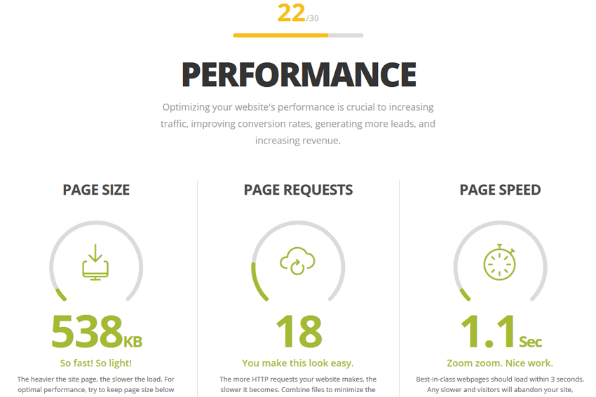
7. Slow-Loading Website
A study by Kissmetrics shows some key stats that concern website load times:
- 40% of visitors expect a web page to load in 2 seconds or less
- 40% of visitors abandon a website that takes more than 3 seconds to load
- Every one-second delay (or 3 seconds of waiting) diminishes user-experience by as much as 16%
Optimizing your website’s load time is not an option you can put off. The sooner you get it done the better.
8. Your Website Lacks Personality or Identity
Having an identifiable brand is necessary for creating a connection with your audience. Your website content should not read like anybody could have written it. Your brand personality should shine through in your website and your marketing campaigns.
9. Non-Responsive Website
In today’s mobile-first world, websites that are not optimized to look good on any device will have their rankings affected on the search engine results pages. But it does not end there: according to studies done by Mobify, “30% of mobile shoppers abandon a transaction if the experience is not optimized for mobile”. That’s the sort of traffic you cannot afford to ignore.
All in all, if you make it a point to put your user first where your website is concerned, you should be okay. Reach out to us here at Eternity to find out more ways we can optimize your site to ensure visitors spend enough time before leaving.


