Google Display Banner Ads Reach Over 2 Million
Google's Display Network is a vast compilation of websites, videos, and apps, over 2 million! Use it to find the right audience for your company's products or services. With complete control over creatives in these campaigns, you'll be able to tell Google exactly what message it should deliver on behalf of your company. So why not get started now? Here are nine best practices to keep in mind when creating your custom display banner ads.
#1 Use Banner Ads In All Sizes That Google Ads Offers
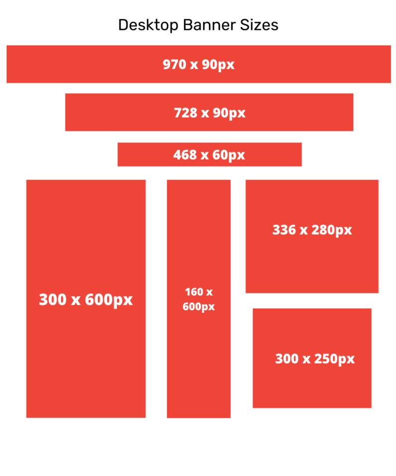
Make all sizes that google ads offers, that way you never miss a chance to show up just because you didn’t have that size banner.


#2 Have Your Logo Clearly + Prominently Displayed
Placing your logo along the top of your display ad can help it be one of the first things users see. This can help with brand awareness and building trust by the users knowing what company’s ad they are looking at. However, logos can also still be on the bottom of your ad, just keep them big and easy to see.

#3 Use A Clear + Easy To Read Font
You only have a few seconds to catch a users' attention, so you want to make sure that they can quickly and easily read your ad's messaging.

#4 Include A Product Image
Products are a great thing to advertise with. If you have a clear physical product that you can showcase it will perform significantly better than an ad without an image. These pair best when the landing page is the same product as well.

#5 Include A Call-To-Action Button
Make sure your ads include a Call-To-Action button. This gives users a place to click and a reason to interact with your ad. Chose a CTA that fits best with your ad's messaging and intention.

#6 Use Brand Colors For The Banner Ads
Staying on brand will help you create brand awareness when users see your ads across different platforms and areas. Always keep your branding consistent.

#7 Make Sure Your Ad Fits Your Website
You want to make sure your ads match your website so that a user knows when they have clicked on the right ad. You don’t want them to think they went to the wrong area and immediately leave your site.


When your ads match your website it keeps your branding consistent and ensures users that they clicked on the right ad.
#8 Use Borders When Using A White Background
Both users and Google don’t like to feel like they are being tricked into an ad. You want to use borders to clearly show that a user is looking at an ad and not another section of the website they are on.

#9 Have One Clear Topic
Make sure the banner ad has one clear topic. Don’t try to fit too much on one ad. When you put too much into one ad it makes it crowded and creates a confusing message. Keep it short, sweet, and to the point.

There are many considerations for Google Display Banner Ads, but if you keep these best practices in mind, with a little planning, you can create an ad that will perform well and deliver your message clearly to your users.
Feel free to reach out if you want help designing or optimizing your display banners!


