
Website Navigation Best Practices
2022 is bringing a lot of change, and we are having to adjust and adapt as quickly as possible. The world of technology in and of itself is constantly innovating new solutions that can be applied to challenges that continue to arise.
This applies to websites as well, not just regarding design, but also regarding the website navigation. Your website's navigation should be logical, user-friendly, and simple to comprehend. Customers may not hesitate to go to your competitor's site if they have even minor trouble finding what they want.
First Off, What is Website Navigation?
Website navigation has many names and is referenced differently depending on who you are talking to. Some of the most common names are:
- Navigation
- Navigation bar
- Nav
- Navbar
- Menu
- Menu bar
- Top Links
- Header bar
The purpose of your website navigation menu is to allow website visitors to search for and find the information they are looking for quickly and easily. The navigation menu should be easy to understand and use, with links that go to the most important pages on your website. You should also make sure that the search engines can easily index all of the pages in your navigation menu.
Alright, now let's hop right in and learn about the most effective website navigation best practices.
1. Plan and Choose the Menu Order Strategically

The order of your navigation menu should be precise and specifically based on the goals of your website. Are you looking for someone to make an order? Are you looking for someone to contact you? Depending on what you are looking for, you will want to alter your navigation and steer your website individuals to those specific destinations.
This step should be taken before you begin building your website, and even before you start writing your content. The statistics have shown that people will remember the information that comes at the beginning and at the end of all of the other information. In addition, it enables the best possible organization and structure before going into the design and development process.
2. Use Familiar Structure and User-Friendly Language

Our best advice is to use a navigation menu that is new but also similar to others. You want website visitors to be able to find and use your website, and the same goes for the language. You want your website visitors to be able to understand what you are trying to portray and what you are trying to get them to do.
Use vocabulary and terms that are easy to understand to your specific audience. Your content writer should make the content easy to understand and digest, as well as easy to follow links and buttons throughout the website. This will make it easy for website visitors to navigate through your website.
3. Adopt the Motto ‘Less is More.’
As we previously mentioned, your website visitors should be able to find what they are looking for, and what you are trying to get them to do. They should not have to search around your website to find your contact information, because they will likely leave the page and leave you with a high bounce rate.
Keep your drop-down menu options to a minimum because it improves user experience. Oftentimes, a lot of menu items will confuse your website visitors. All-in-all, keep in mind that users are more likely to stay on your website if the target is easy to find and use.
4. Be Specific with Your Menu Items

Make it easy for your website visitors to know where they are located on your website. This is not only what makes a really great website page navigation, but it also allows users to find what they are looking for and to keep coming back for more.
In addition, context is critical. If you have buttons, icons, images, or text content that is linking to other pages, ensure that you provide their descriptions. This solidifies that your website visitors will have clues on the menus and will know what to expect on the various website pages.
5. Navigation Affects SEO and Search Engine Ranking
The quick answer is YES. There are many factors to consider, but generally the way a website's navigation system works can have a significant effect on search engine ranking. It helps determine which pages are seen by search engines and how often they rank in search results for specific keywords or phrases. A good website navigation will also help your visitors find what they're looking for more easily, which will improve their experience on your site and keep them coming back for more!
6. Use Google Analytics to Inform Navigation Structure
Google Analytics is a fantastic and effective method to inform your navigation items and structure. It has many features for this. Using data to dictate the direction of your navigation can also be an excellent way to overcome those "I think this will work" moments.
Heatmaps
One of them is a Heatmap option. The heatmap allows you to see where people are most likely to click on your website page, and the results will help you determine which items they find most interesting. You can then adjust your navigation menu accordingly.
Behavior Flow
The Behavior Flow report visualizes the path users traveled from one page or Event to the next. This report can help you discover what content keeps users engaged and can also inform what items you may want in your top level or drop down menu items.
7. Link Back to the Home Page with Your Logo
Something that many people overlook, is the simple act of linking your logo to your home page at the top of the page. This is a standard feature that enables users to always have access to their starting point. This requires a logo, something that the target audience will associate with your brand.
8. Make Primary Navigation Standout

This one seems obvious, but do not hide your main navigation. It should be visible to your website visitors in order to capture their attention almost immediately. Typically, website navigation is located at the top of the page or sometimes aligned to either the left or the right top corner. Either way, make it stand out from the rest of the page.
9. Keep Menu Item Options to a Minimum

You should not only keep your drop-down options to a minimum, but you should also make your main menu short, up to seven items. This is the optimal amount of information that the human short term memory can contain at one time. In addition, fewer items on your main navigation will allow your website visitors to quickly find what they are looking for.
10. Add a Search Bar

Perhaps you have a lot of information on your website, and you need a search bar. This can make it easy for a website visitor to find the page they need, without having to scroll through your website. You can use a sticky search bar that is always visible for users. contact
11. Don't Display Social Media Icons in Navigation
Unless you are really trying to promote clicks off to your social media as the primary call-to-action, then it is best to keep them in the footer and not within the navigation. Otherwise, they will simply be distracting website users and disrupting your natural funnel and path you wish them to take on your site.
12. Use Mobile Responsive Navigation
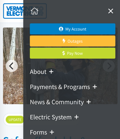
Although it seems self-explanatory nowadays, the use of a responsive website will ensure that your website will look great on every device that a website visitor might use. The hamburger menu is useful in ensuring website responsiveness for both mobile and desktop devices. This type of menu has a compact size that fits well on mobile devices without causing distortions of other buttons.
Want to Know Some Mind-Blowing Stats About Mobile Internet Traffic?
- Up to 70 percent of web traffic comes from mobile devices.
- 83% of mobile users expect a perfect experience whenever they visit a website with their mobile device.
- Google is responsible for 96% of search traffic coming from mobile.
There is a possibility that we might all be addicted to our mobile devices. That aside, it is obviously important to ensure your site is mobile-friendly and responsive to any device or screen size. A mobile first design approach is a key to success.
12. Add Recommended Content to Recirculate Traffic
If your website does contain a lot of content, we recommend content that can recirculate traffic. This ensures that visitors will be able to navigate through your website based on related content. In addition, it also ensures that users will stay on a website as they encounter information that may be of interest to them.
13. Consider Users with Visual Impairments
Make Your Website ADA Accessible
ADA and website accessibility should be considered when building your navigation. This means that your website will be easy to use for website visitors who have visual impairment or other disabilities. Considering it is the primary system of which users find their way through your site. Links should be clear enough to read, and accessible by keyboard navigation and text readers.
Web design is constantly evolving. And with the evolution of web design, it has become increasingly important to consider ADA. One reason for this consideration is that search engines take accessibility into account when ranking search results. A search engine may be less likely to rank your website highly if you have an inaccessible site than a website with accessible navigation. Another reason why you should consider ADA in your web design process is because it helps connect with customers who are disabled or visually impaired. This group of people might not hesitate to go to one of your competitor's sites if they find it difficult navigating through yours due to inadequate navigational aids and links that are hard to read or out-of-reach for keyboard navigation and text readers.
14. Display Contact Information Clearly
While we are on the topic of easy-to-use features, a contact bar is another great one. This allows website visitors to quickly and easily get in touch with you either by phone, email, and whatever other options you choose to include. Your website navigation should make it extremely easy for them to do so.
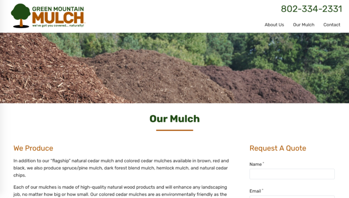
15. Add a Super Footer or Mega Menu

Like on the website above, we highly recommend a large footer. Footers are used to display links and contacts to the website owners. They can also be used to display an email sign up, social links, as well as address information to the company. If your website has a lot of information, it might be helpful for people to use the footer to find important links. Mega menus can also be a great way to present a navigation system when you have a large amount of menu items.
As search engines continue to evolve, it is important that your website evolves with them. This means ensuring that you are using the latest techniques in website design and navigation in order to keep up with the competition. In addition, it is critical to make sure that your website is accessible and easy-to-use for all of your visitors. If you're not sure where to start, consider just picking 3 of the tips we've provided in this article and complete those. Then move on to the next after that. And as always, don't hesitate to reach out if you need help getting started on your website redesign!