We’ve all seen the hamburger icon before. In fact, it’s so common on our screens today, that most of us don’t even give it much thought when we use it.
Usually found at one of the top corners of our screens and consisting of three parallel lines stacked on each other, this icon seems to have always been around.
It’s simple to use, easy to understand, and you know exactly what it’s used for…even if you’ve never seen it. The hamburger icon can be defined as a classic in a way that very few other user interface features can.
So who designed it?
To answer that, we have to go back to the late 70’s and early 80’s-literally, prehistoric times in terms of software and graphical user interface development. Back when the ground breaking Xerox “Star” personal workstation was just entering the scene.
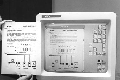
The Star workstation, otherwise officially known as the Xerox 8010 Information System, was the first system to incorporate many of the systems and features that we take for granted today including, folders, email, the hamburger icon, among many others.
![]()
This was the phase of early adoption, and the designer of the hamburger icon was also in charge of the entire system's user interface-including the icons responsible for communicating functionality to the very first computer users.
His name: Norm Cox.
His plan was to keep it simple and instantly relatable and recognizable. In his own words, “…I designed that symbol many years ago as a "container" for contextual menu choices. It would be somewhat equivalent to the context menu we use today when clicking over objects with the right mouse button.
Its graphic design was meant to be very "road sign" simple, functionally memorable, and mimic the look of the resulting displayed menu list. With so few pixels to work with, it had to be very distinct, yet simple. I think we only had 16x16 pixels to render the image. (or possibly 13x13... can't remember exactly).
Interesting inside joke...we used to tell potential users that the image was an "air vent" to keep the window cool. It usually got a chuckle and made the mark much more memorable.
It's been nice to see that so many of our designs from those early pioneering years have stood the test of time and become ubiquitous symbols in our UI's.”
But after its debut with the Star Workstation, the hamburger icon disappeared…until much recently.
The Return
With the rise of much smaller screens and interfaces ushered in by the rise of smart-phones. It became increasingly important to find functional and effective ways to fit everything onto a 4-inch display.
The jury remains out on which app developers reached for the shelves of time first to incorporate the hamburger icon, but the apps in contention include: Voice Memos from iOS and Tweetie for iPad
And finally, in 2010 Facebook replaced their grid icon with the hamburger icon, thus making it a trend and firmly embedding it within the popular psyche.
Quite a journey.

