


Why AI Can't Understand Your Website Buttons — And What to Do About It

In plain terms:
A descriptive CTA label is one that tells both your visitor and AI exactly what happens when they click — without needing the rest of the page to explain it.
Instead of “Download,” it’s “Download Our Compliance Checklist.”
Instead of “Learn More,” it’s “View Our Case Studies”
The label does the work on its own.
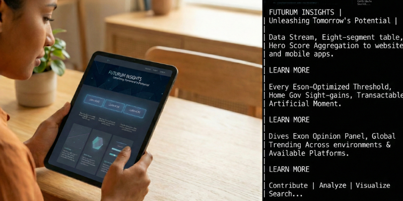
Three feature blocks. Three buttons. Three times the words “Learn More.”
To someone scanning the page, it looks great. Clean layout, generous whitespace, everything neatly aligned.
But here’s what most people don’t think about — and it’s something we talk about with clients all the time: your visitors aren’t the only ones reading your site anymore.
AI models — the ones powering search results, voice assistants, and the AI-generated answers that are steadily replacing traditional search clicks — are reading your pages too. And when they hit a button that says “Learn More,” they don’t learn anything. Currently, they can’t reliably connect a button to an image sitting above it, or infer meaning from your page's visual layout. They’re working from a stripped-down version of your text — and a generic label gives them nothing to anchor to.
They read the text, try to pull meaning from it, and move on.
“Learn More” gives them nothing to work with. Same goes for “Click Here,” “Download,” “Get Started,” and every other two-word CTA showing up on millions of websites right now.
This Isn’t Just an Accessibility Argument (Though That Still Matters)
Screen readers pull links out of context, so “Click Here” is meaningless to visually impaired users. That’s a real, important argument, and it’s been around for over a decade.
Here's what changed: AI reads your buttons the same way a screen reader does. Strip away the layout, the images, the visual design — and both are left with just the words. Which means writing for accessibility and writing for AI visibility are now the same thing.
That's not a coincidence. It's the whole point.
Large language models don’t crawl your site the way a search bot did ten years ago, indexing keywords and following links. They synthesize your content. They read your page and try to understand what you offer, who it’s for, what problems you solve, and what actions a visitor can take. Then they use that understanding to generate answers, recommendations, and citations in AI-powered search results.
When an LLM lands on a well-structured page where every CTA is specific and descriptive, it builds a rich, accurate picture of your business. When it finds a page where every button says “Learn More” or “Get Started,” it gets a wall of generic actions with no context to attach them to. That’s not a usability gap. That’s a discoverability gap — and it directly affects whether AI surfaces your content or someone else’s.
Google’s helpful content guidance keeps emphasizing specificity and user-first language — content that clearly communicates what it is and who it’s for. Your headings, body copy, and meta descriptions are all working toward that standard. Generic button labels are quietly undermining the rest of the page’s effort.
What AI Actually Reads When It Hits Your Buttons
A descriptive CTA can communicate up to four things at once:
- The action being taken
- The content behind the click
- The intended audience
- The value proposition
A generic CTA communicates one thing at best — that a click is possible. That’s it.
Here’s what that looks like side by side. Read just the left column as a list: Download. Start Free Trial. Contact Us. Shop Now. Learn More. Stripped of surrounding content, those labels could belong to any company in any industry. They tell AI nothing.
❌ Generic — What AI Sees |
✅ Descriptive — What AI Learns |
Download |
Download Our Compliance Checklist |
Start Free Trial |
Start Your Free Semrush Trial |
Contact Us |
Request a Free Roof Inspection |
Shop Now |
Shop Handmade Ceramic Mugs |
Learn More |
See How We Cut Client Costs |
Now read the right column. Even without any surrounding context, you know you're looking at compliance documentation, a free trial for Semrush, a roofing company that offers free inspections, a ceramics shop, and a business that helps clients cut costs. Every one of those labels is doing real content work. Every one is a signal.
That’s the difference between text that helps AI understand your business and text that gets skipped over.

Buttons Have Two Jobs. Most Websites Are Only Doing One.
So if descriptive CTAs are clearly better, why is the internet still drowning in “Learn More”? As a copywriter, I think about this a lot, honestly.
It comes down to how buttons get thought about during the design process. Buttons are visual elements — designed to stand out, draw the eye, and signal that an action is available. Color, shape, placement, contrast: all of that exists to make the button noticeable. And it works beautifully. Nobody scrolls past a well-placed CTA without seeing it.
But getting someone to notice the button is only half the job. The other half — the half that actually drives results — is what the label says once they’re there. The visual design catches attention. The label converts it into action.
Right now, most websites are nailing the first job and quietly dropping the second. Every other piece of copy on a page gets scrutinized for clarity, specificity, and meaning. Button labels? They get reviewed for length and visual consistency. That’s the disconnect.
The visual purpose of a button should serve its content purpose — not override it. When the label says nothing meaningful, the button is doing half its job at best. And giving AI absolutely nothing to work with.
“But People Already Know What They’re Clicking”
This is the most common pushback we hear, and honestly, it sounds reasonable on the surface. If someone just read a paragraph about your compliance checklist, they know what “Download” means, right?
But that argument holds up only if two things are true. And neither of them usually is.
The first assumption: people read your page from top to bottom before they reach the button. They don’t. People scan, jump around, and skip whole sections. Many visitors land mid-page from a search result or a shared link, and the button might be the first thing they actually read. If it says “Download,” they have no idea what they’re downloading — and most won’t scroll back up to find out. They’ll just leave.
The second assumption — and this is the bigger one: humans are the only audience reading your buttons. They’re not. An LLM can read the text surrounding your button — but currently, it can't reliably connect the dots the way a human reader does.
When AI systems process your page, they break your content into small fragments for storage and retrieval. A button label can easily end up separated from the paragraph that explains it. And when the same generic label appears multiple times on a page — three “Learn Mores,” two “Downloads” — AI systems can’t reliably distinguish which label belongs to which context. The label either carries meaning on its own, or it creates confusion.
“People already know” is a human argument. It doesn’t account for how AI reads your site. And here’s the part worth sitting with: roughly 60% of searches now end without a click, AI is increasingly the filter that determines whether a human ever reaches your page at all.
The 3-Signal Test: A Simple Framework for Every CTA You Write
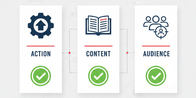
Here’s a practical tool we use when auditing client sites, and you can apply it to every button label you write. A strong CTA should answer at least two of these three questions:
▶ The 3-Signal Test for Button Labels Signal 1 — What will I do? (the action) Signal 2 — What will I get? (the content or outcome) Signal 3 — Is this for me? (the intended audience) The rule: your label must answer at least 2 out of 3. |
Here’s how that plays out in practice:
Signal 1: The Action |
Signal 2: The Content |
Signal 3: The Audience |
What will the user do? |
What will they receive? |
Who is it for? |
"Download" |
❌ Missing |
❌ Missing |
"Download the Compliance Checklist" |
✅ Answered |
❌ Missing |
"Download the Lab Manufacturers Checklist" |
✅ Answered |
✅ Answered |
“Download” answers zero signals.
“Download the Compliance Checklist” answers two — what you’ll do and what you’ll get.
“Download the Lab Manufacturers Checklist” answers all three.
You don’t always need all three, but you always need at least two.
And “descriptive” doesn’t mean “long.” There’s a huge distance between “Learn More” and a twelve-word sentence. The sweet spot is usually four to eight words — enough to carry real meaning, short enough to fit most layouts.
Try This on Your Own Site
Pull every CTA from one of your key pages into a plain list — just the button labels, nothing else, no surrounding content. Read them out loud.
If it sounds like: “Learn More - Download - Get Started - Click Here - Learn More” — that’s exactly what AI sees. A page full of generic actions that could belong to anyone, in any industry, selling anything.
Now rewrite that list so every label passes the 3-Signal Test. Read it again. You’ll feel the difference immediately — and so will your visitors and the AI systems deciding whether to recommend you.

Every Text Element Is Either a Signal or Noise
This article is about button labels, but the underlying principle is much bigger than CTAs. Every text element on your website is being read, processed, and evaluated — not just by humans, but by the systems deciding whether to surface your content in AI-generated answers.
All of it either contributes to a clear picture of your business or muddies it:
-
Your headings
-
Your navigation labels
-
Your image alt text
-
Your meta descriptions
-
Your button labels
There’s no neutral ground anymore. Every piece of text on your site is either a signal that tells AI what you do and who you serve, or it’s noise that gets passed over.
Generic CTAs were always a missed opportunity. Now they’re a liability.
So the next time someone suggests putting “Learn More” on a button, ask: learn more about what? If you can’t answer that in the label, neither can AI — and neither, honestly, can your visitors.
See How Your CTAs Hold Up — Free One-Page AuditSend us one key page from your site — your homepage, a service page, wherever you're driving traffic — and we'll run it through the 3-Signal Test. You'll get a plain-language review of every CTA on that page: what's working, what's not, and exactly how to fix it. ▶ Request Your Free One-Page CTA Audit ◀ No fluff, no sales pitch. Just a real look at whether your labels are working as hard as they should be. |
Frequently Asked Questions
