Rural Edge
RuralEdge is a non-profit affordable housing and community development corporation that has served the Northeast Kingdom for over 30 years. Our mission is to strengthen Northeast Kingdom communities, one home at a time.
Our role
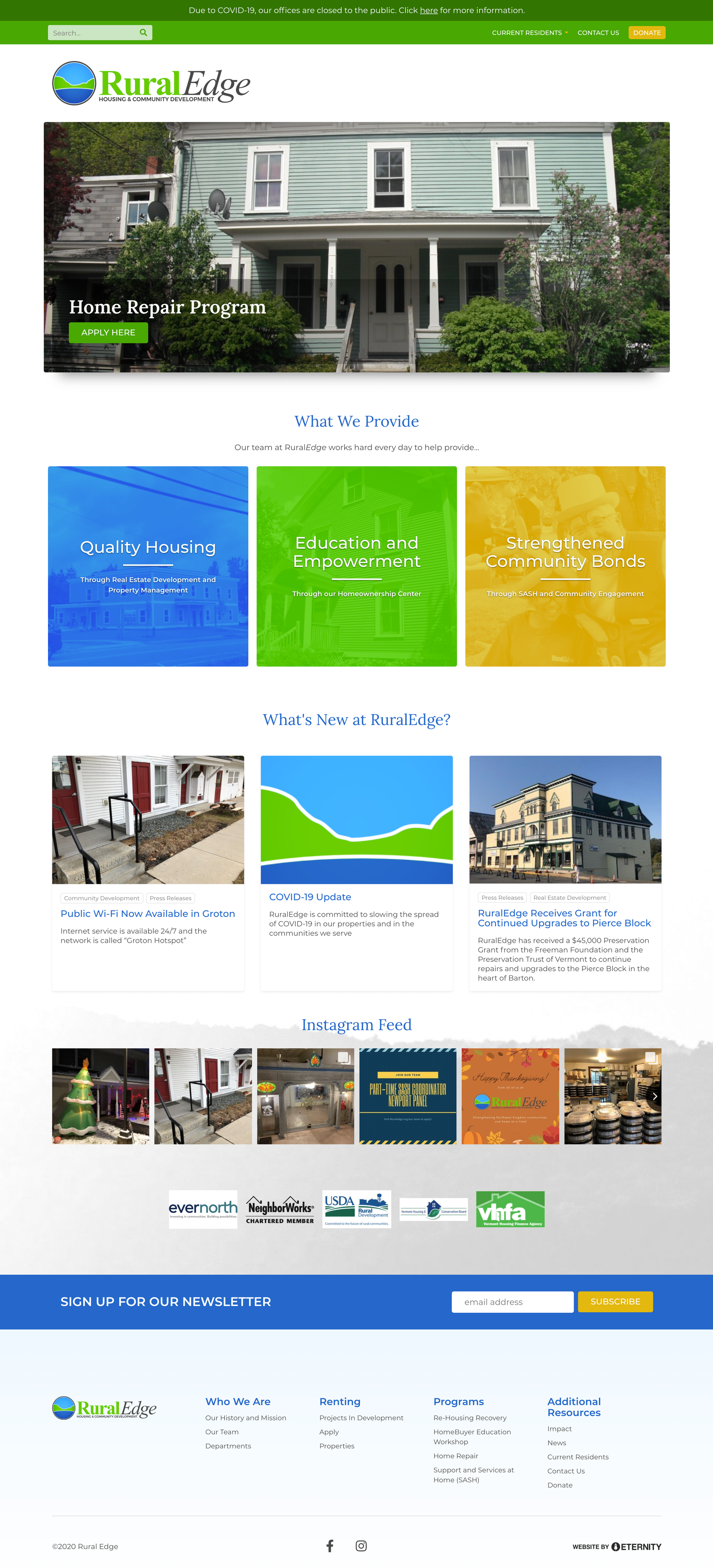
We developed a new brand identity, updating their brand mark to reflect the iconic Willoughby Gap. In addition to a new logo, we also designed and developed a modern, mobile-responsive, website.


Branding
The RuralEdge logo was designed to visually connect the organization’s mission with its Vermont roots by featuring the iconic Willoughby Gap at Lake Willoughby. The circular emblem captures the distinctive silhouette of the twin cliffs, framed against a bright sky and rich blue waters, evoking a sense of place, community, and natural beauty. The fresh green and blue palette reflects growth, vitality, and stability—key values in housing and community development. The bold serif “Rural” paired with the elegant italic “Edge” balances approachability with professionalism, while the logo’s adaptability ensures it remains impactful in both full color and single-color applications.
- #3BB0FF
- #62C900
- #0065C9